 Post/Pre Layer
Tuesday, 4 August 2009
Monday, 3 August 2009
Wednesday, 29 July 2009
Unsupervised Lab
Wednesday, 15 July 2009
Thermal Infrared Image Interpretation

Roads: Roads usually appear lighter because they have a higher radiant temperature and have a greater emission of energy.
Natural and man-made vegetation: Vegetation appearances different because it may be an indication of vegetation health or moisture content.
Sidewalks and Patios: Similar effect observed in roads.
Storage sheds in backyards: Some storage sheds may be reflective and hence emit more energy than a shed that is painted darker.
Automobiles: It depends if the car is in the on position or has recently been turned off. The engine emits energy and hence will show lighter compared to the back portion of the car.
Bright spots on many of the roofs: This could be a chimney or some type of vent that releases heat from the house.
Wednesday, 8 July 2009
Lab 2- Multi-Spectral Remote Sensing Systems


Although it is difficult to identify features in the SPOT image, the MSS image in comparison allows for the identification of some features. There is definitely differences in what appears to be vegetation in the second image. It is difficult to distinguish vegetation in the first image, although you can see some areas, particularly in the water show up dark compared to the rest of the image. However, it is virtually impossible to determine vegetation on land. Looking at the second image, vegetation appears blue. You can see clearly the vegetation on land. I think the blue areas in the water may be smaller islands, perhaps mangroves!
Monday, 29 June 2009
Module 1
Sunday, 3 May 2009
Wind Power

Taking into consideration the criteria for a windmill farm outlined by BEER, Station SVNM4 seems to be a good sight. The wind data (7 kts) is above what is required to power the wind turbines. In addition it is beyond the distance to avoid noise pollution and shadow flicker. This area is not in any major bird migratory pathway and doesnt experience high boating traffic.
Sunday, 26 April 2009
Sunday, 19 April 2009
Sunday, 12 April 2009
Contiguous Cartogram Map
Saturday, 4 April 2009
Dot Distribution Map
Sunday, 29 March 2009
Saturday, 21 March 2009
Choropleth
Saturday, 14 March 2009
Choropleth Lab

I chose the US National Atlas Equal Area map projection. I think this view best displayed the states. In addition, I used the sequential color scheme and chose to display my legend horizontally. I like this better than displaying it vertically. I think it has a sleek look without all the text of the standard legend.
Friday, 6 March 2009
Lab 4 Map Composition
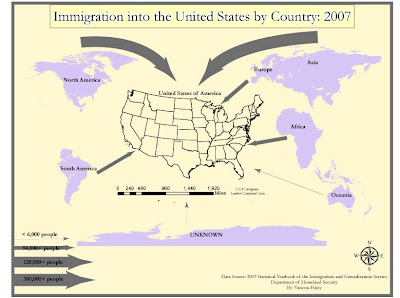
 OK so I have been working on the Lab for over 10 hours! At first the map was SUPER tiny and I could not figure out for the life of me what I did wrong. I had to end up opening a new document and just copy and paste everything over. Then just when I thought I was finished, I now realized that my neat line is not even appearing. The strangest thing is, I can see it in Illustrator and also after I save it as a jpeg and reopen the jpeg file. For some reason, the neat line does not show when I post it to my blog. Illustrator is too hard to use without any instructions and it takes up so much time. I will go ahead and post my pics to my S drive as well, I can't work on this for 10 more hours just to get the neat line to appear.
Saturday, 21 February 2009
Saturday, 24 January 2009
GOOD MAP
BAD MAP
Top choices to work in the US

My first choice to work will be FL and anywhere in the south east. The main reason is simply because it's close to home (The Bahamas) and has a climate similar to home. My second choice would have to be LA and NY because I always wanted to live and work in a big city (but only for a short time). By default, all other states were chosen as my last choice!
Subscribe to:
Comments (Atom)


